

Optimizing the overall user experience and of an AI-powered women’s fitness app using OOUX & ORCA
-

Company
Wild.AI
-

My Role
In-House UX Designer
-

Project Type
Mobile App
-

Team
3 Designers, 1 PM, 1 Dev
-

Tools
Figma, Typeform, Firebase Analytics, OOUX
-

Year
2025
Key Accomplishments
-

Identified optimization opportunities by conducting a full user flow audit of the live app
-

Identified several UI inconsistencies and unituitive designs by completing a full OOUX interface audit
-

Conducting usability testing with current and new users to validate optimization ideas
-

Eliminating UI inconsistencies with ORCA wireframing and a new component library
Company Background
Women are wired differently, so why shouldn’t their training plans be?
Wild.AI aims to empower women in all life stages by tailoring training plans and suggestions based on their hormones, cycle (if they have one), and symptoms using AI. The app helps women get better, stronger, and faster over time by working WITH their bodies instead of against them.

Promo image from Wild.AI showing a woman running
My Value Add
The team was working to improve the app's overall user experience and add new features to become the go-to fitness app for women.
I helped with several initiatives:
adding consistency to the UI with a new component system
identifying and optimizing user flow issues via app audits
identifying major usability issues by testing the app with new users
conducting the OOUX/ORCA process to resolve issues discovered
How It Works
The app uses AI to learn about the user’s cycle and teaches them how to train effectively in each cycle phase.
The app combines user input (symptoms, training sessions, cycle) with standardized data to deliver personalized training, nutrition, and supplement recommendations.
Training plans sync with the user’s cycle if they have one, adapting each day’s session to their cycle phase symptoms.

Diagram of how Wild takes user inputs and gives recommendations.
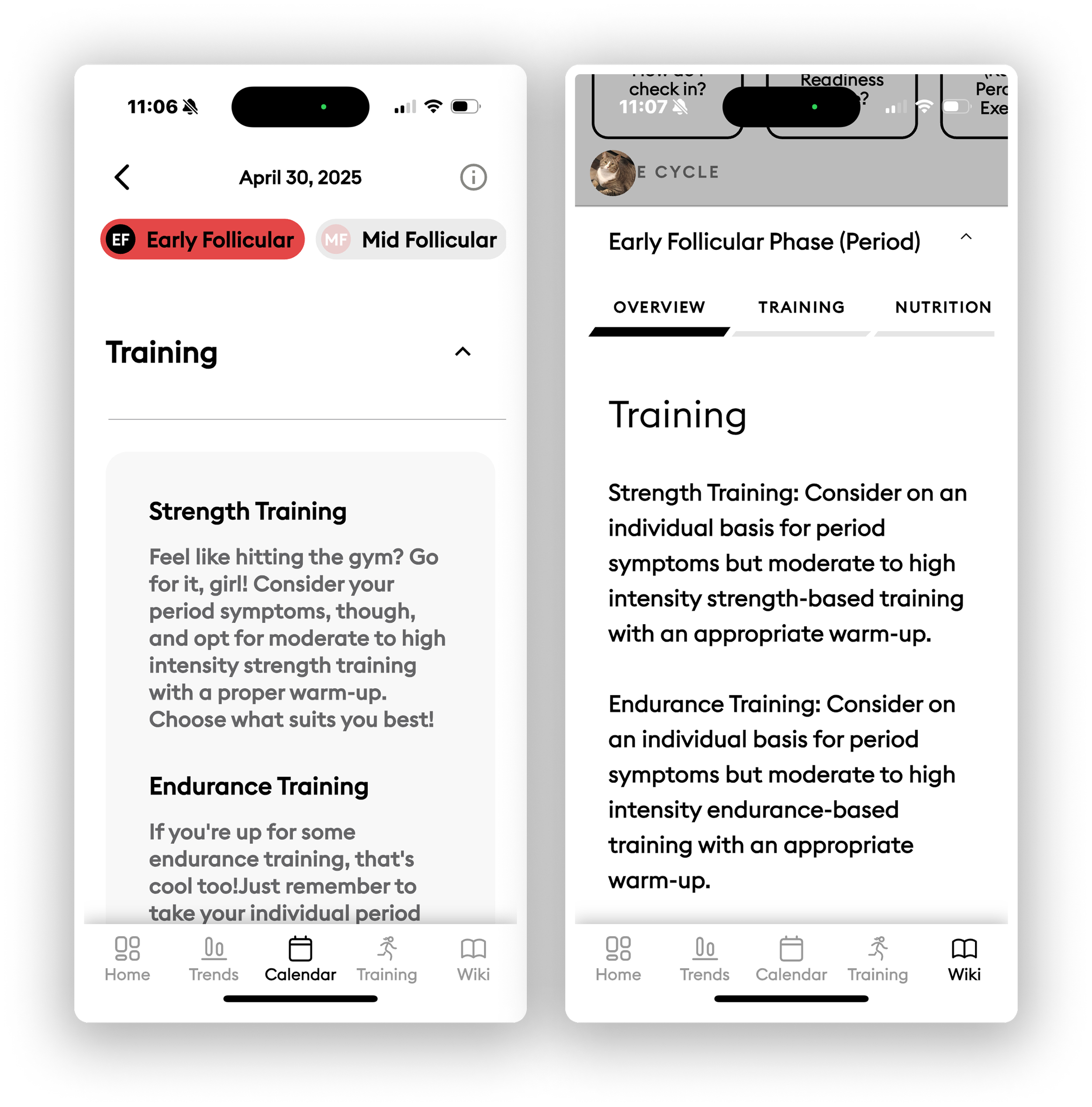
User Flows + Information Architecture
As a new user, I identified some strange issues, such as being able to “rate” a training session scheduled in the future, meaning I could rate the difficulty of a session I haven’t even completed yet!
We had a good laugh about this!
I uncovered these issues through a user flow audit, mapping screen connections and identifying errors, edge cases, and confusing moments, which I shared with the team.
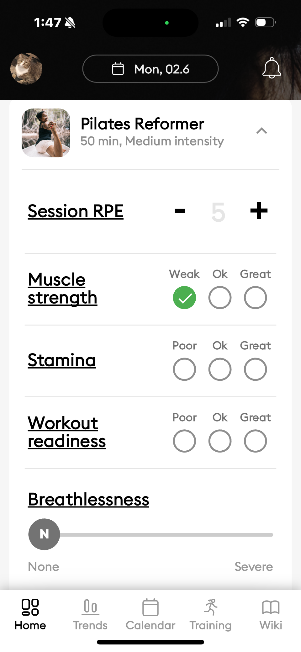
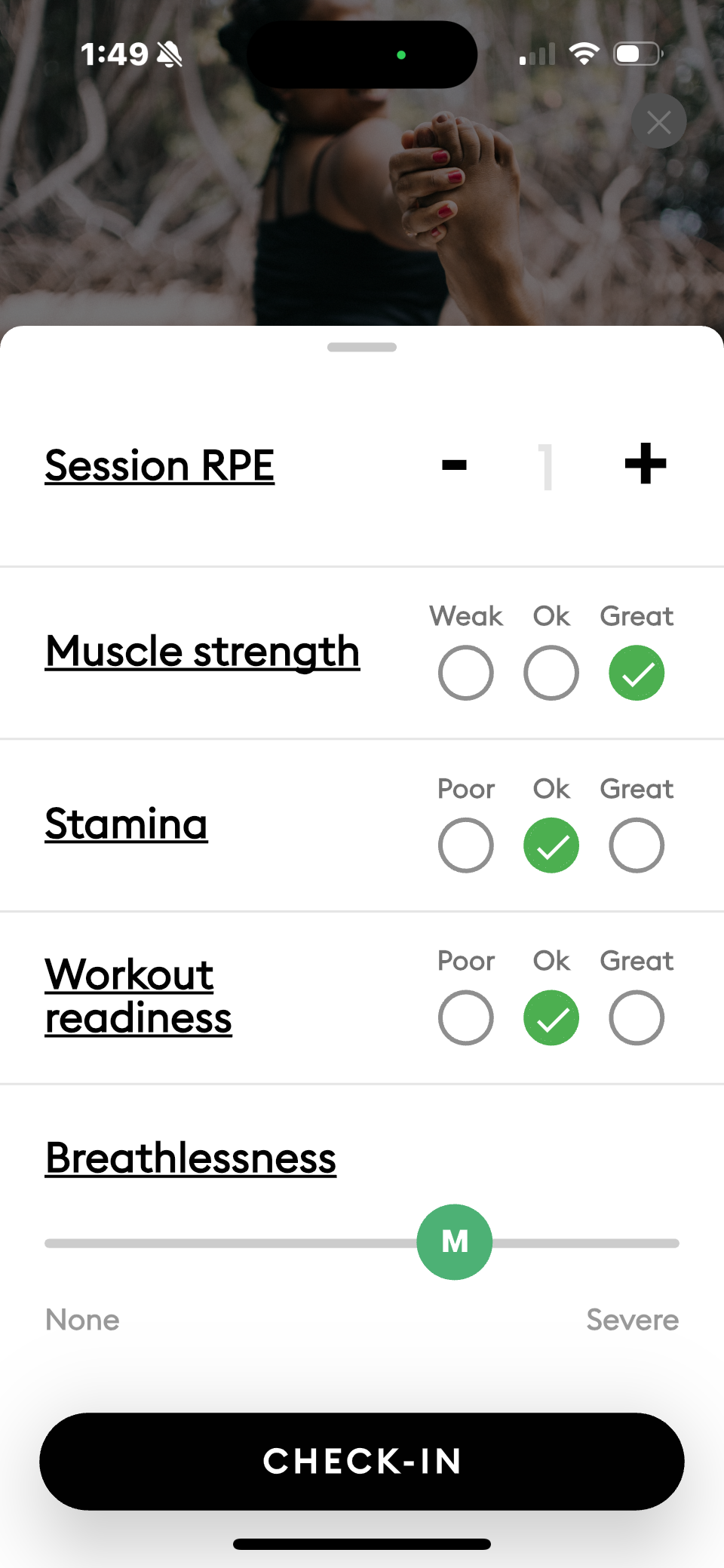
The screens that show how a user can rate a training session. The date shows June 2, 2025 which is far into the future.
Main Flow & Feature Issues Discovered
-
Training Session
- Too many ways to log a session
- Can “rate” a session in the future
- Users are not able to create recurring sessions -
Training Plans
- The app does not prevent a user from creating a training plan for an event less than 2 weeks from now
- Cycle syncing is unclear -
Wearables
- There is no clear connection between the data the app gets from the wearable and how it relates to training plans/sessions
-
Calendar
- No clear purpose
- Not connected to training schedules
- Displays redundant information -
Trends
- The graphs are hard to read
- Hard to understand how users’ inputs affect what the app recommends -
Profile
- The settings a user might want to easily change (life stage, unit, check-in symptoms) are buried deep in menus

Image showing how I laid out all the screens to map out the flows and information architecture.
Interface Audit & Component System
I then conducted a full interface audit and found major UI inconsistencies, like six different dropdown styles!
Since we want to elevate the visual design and branding anyway, we are creating a new streamlined component library that will unify elements like dropdowns, calendars, pickers, and buttons.


Images showing the 6 different dropdown styles we had accumulated.
User Research
The team had already done some user research so I analyzed those to understand current pain points and needs.
Users love features like wearable integration, period tracking, and the readiness score, but there are clear opportunities for improvement.
Research Findings
-
Users want clearer and more specific insights into their app and wearable data
-
Users want clearer and more specific recommendations based on their inputs
-
The user’s want the onboarding process and daily check-ins to be simplified
-
Users want more specific and detailed training plans and want plans for specific events and general plans
Usability Testing
Now that I’ve identified potential areas for optimization, I want to validate them with users, specifically with users who’ve never used the app before.
Usability testing with new users will show where the app is truly unintuitive. I’m also evaluating app analytics related to my audit findings. These findings plus our previous research will help prioritize ideas.
-
Current User Tasks:
- show how you’d create a training plan/session
- show how you’d track your symptoms over time
- show how you’d understand your current cycle’s phase -
App Analytics
- how many people complete a training plan after creating
- how many people check-in everyday
- the most used features
OOUX & ORCA
But Maha, once you’ve synthesized all these findings for optimization how will you fix them? And to that I say, optimization happens from the inside out.
I led an Object-Oriented UX approach with my coworker to address usability and flow issues from our research, testing, and audits.
OOUX audit - look at our screens more deeply and identify any unintuitive objects (masked, isolated, broken, or shapeshifter)
ORCA process - lay out our objects, relationships, calls-to-actions, and attributes so we can remedy these unintuitive objects, restructure flows, and see how our new features fit into our system


Testing: Quantitative Data
Usability testing with 5 new users showed that 100% of them either abandoned a task or completed a task with difficulty.
Most of the tasks that the users struggled with were related to the training sessions, training plans, and understanding their cycle, which are the main purposes and offerings of the app.
# of Users out of 5 who struggled with the task
Testing: Qualitative Data
In addition to this, users had many pain points and confusion about what the app was doing and showing.
They found many tasks processes to be painful, information about their cycle to be extremely wordy and undigestible, the data visualizations to be hard to read, and felt the app didn’t give them enough feedback about things they did.
“[Creating a training plan was] painful, I think it was complex and the steps were not clear”
“It’s way too much reading, it’s great to have all this information but it’s not digestable because it’s all in paragraph style”
“It doesn’t seem like it did anything to add training sessions from my plan”
Iteration: Resolving Unintuitive Designs
Using this testing data, the unintuitive objects I identified in my OOUX audit, and the inconsistencies I found in the interface audit, my fellow designer and I completed the ORCA process.
I’ve identified the following on our screens in my OOUX audit:
isolated (missing important relationships)
broken (missing important CTAs)
masked (2 different things look like the same thing)
shapeshifting objects (the same thing looks different in 2 places)
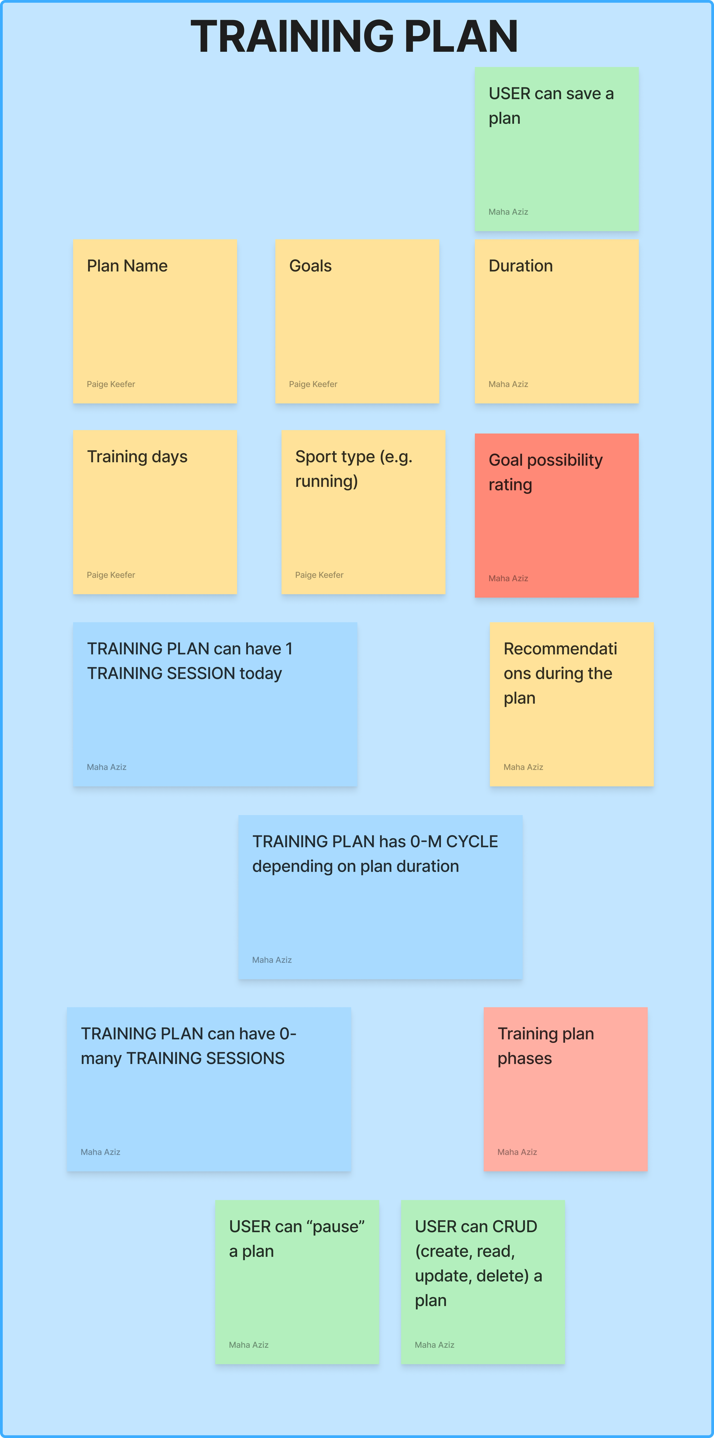
By using the ORCA system map we created and the new component library, I made new versions of the screens, specifically related to the training plans, sessions, and cycle information.
Due to changes in the organization, I was not able to get the app analytics I planned to analyze, so my iterations were based only on the previous user research and my usability testing.

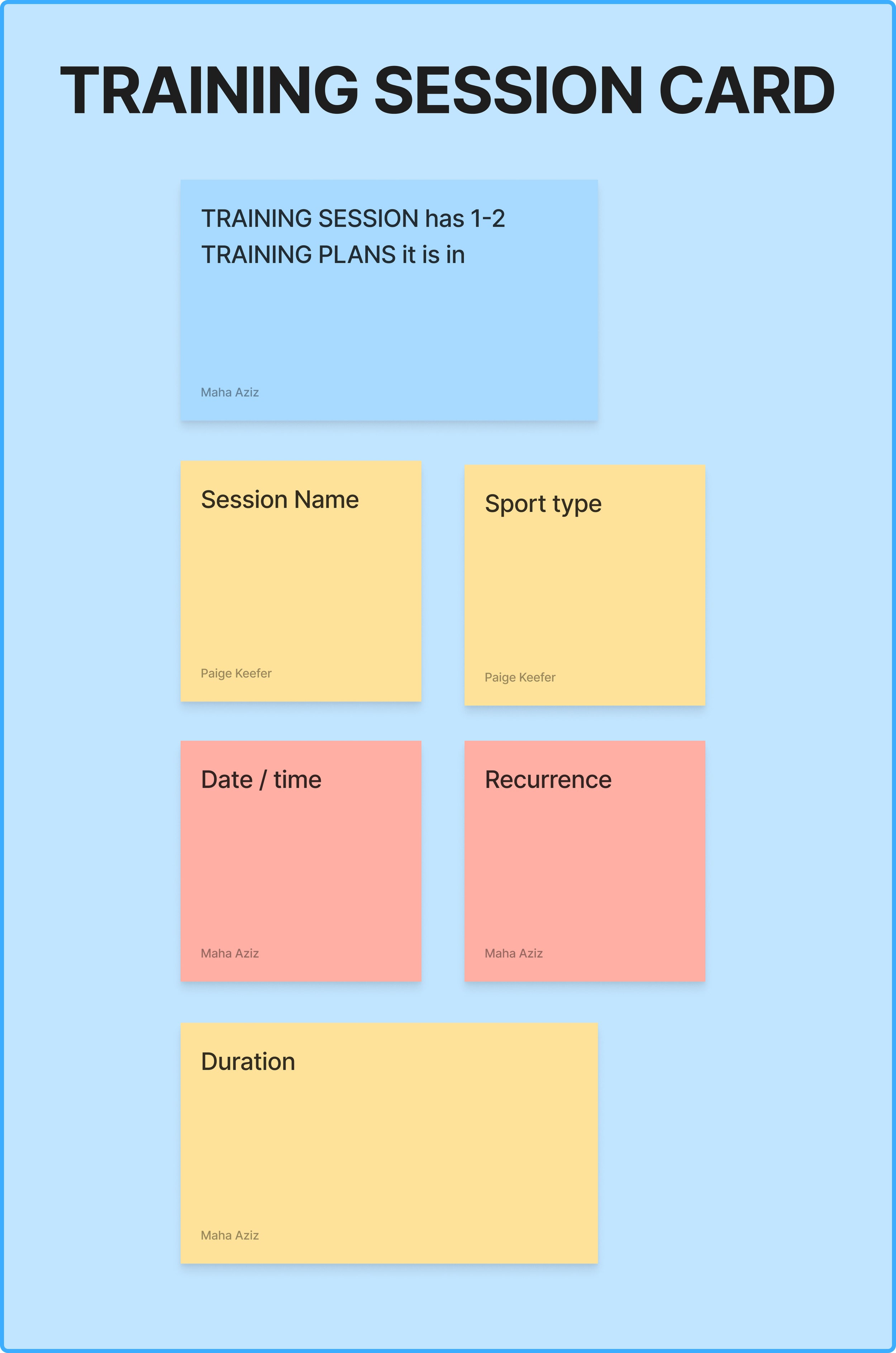
A snapshot of the ORCA board I created, showing the OBJECTS in blue, the CTAs a user can do to each object in green, and the attributes of the objects in yellow and red. Darker shades indicate that it's a possibility, while the lighter shades indicate that the app already shows this or does this somehow.
Iteration: Consistent Components
Some of the shapeshifting objects were easily resolved by implementing a consistent component, created with our new branding.
In the images below the shapeshifting dropdown for “sport type” is shown, where one is a true dropdown menu and one is a bottom sheet that pops up. The new design concept is shown with the consistent dropdown component.

BEFORE: 2 different dropdown menus for sport type when creating a training plan or session

AFTER: New unified component created for all drop downs in training sections
One of the major complaints users had was that the app had too many blocks of text that were hard to read.
In the images below, the shapeshifting cycle phases wiki information is shown. The new design that my fellow designer made shows how a consistent wiki would look, unifying the shapeshifter, in addition to breaking up the text into digestible bites with better hierarchy.
Original designs where the cycle phases information was shown in 2 different ways.
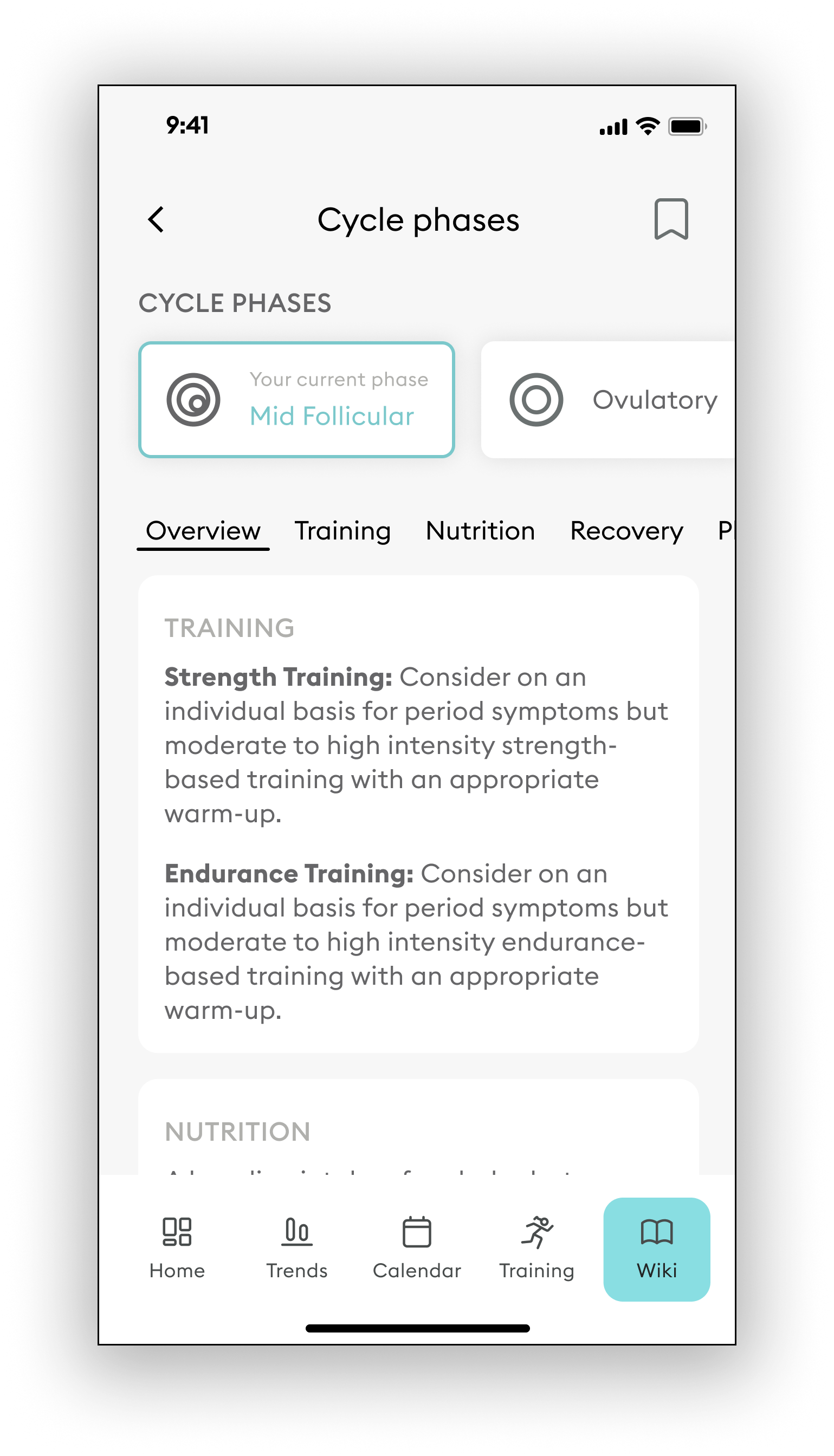
The new components for the phase information
Iteration: ORCA Wireframing
Usability testing revealed that users struggled to tell which training sessions were part of their plan because of a masked object.
While the app does add the plan’s sessions to their schedule, when users create a plan it lacks clear confirmation, and the plan sessions look exactly like one-off sessions (masked object).
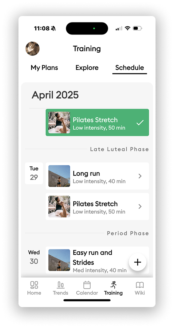
I created an ORCA “wireframe” to organize training session attributes, including the associated plan, and designed a high-fidelity version using our new component library. Now users can clearly see which sessions are part of a plan.
I also recommended making the schedule view the default in the Training tab on the main navigation, since users were confused when they didn’t see it upfront.
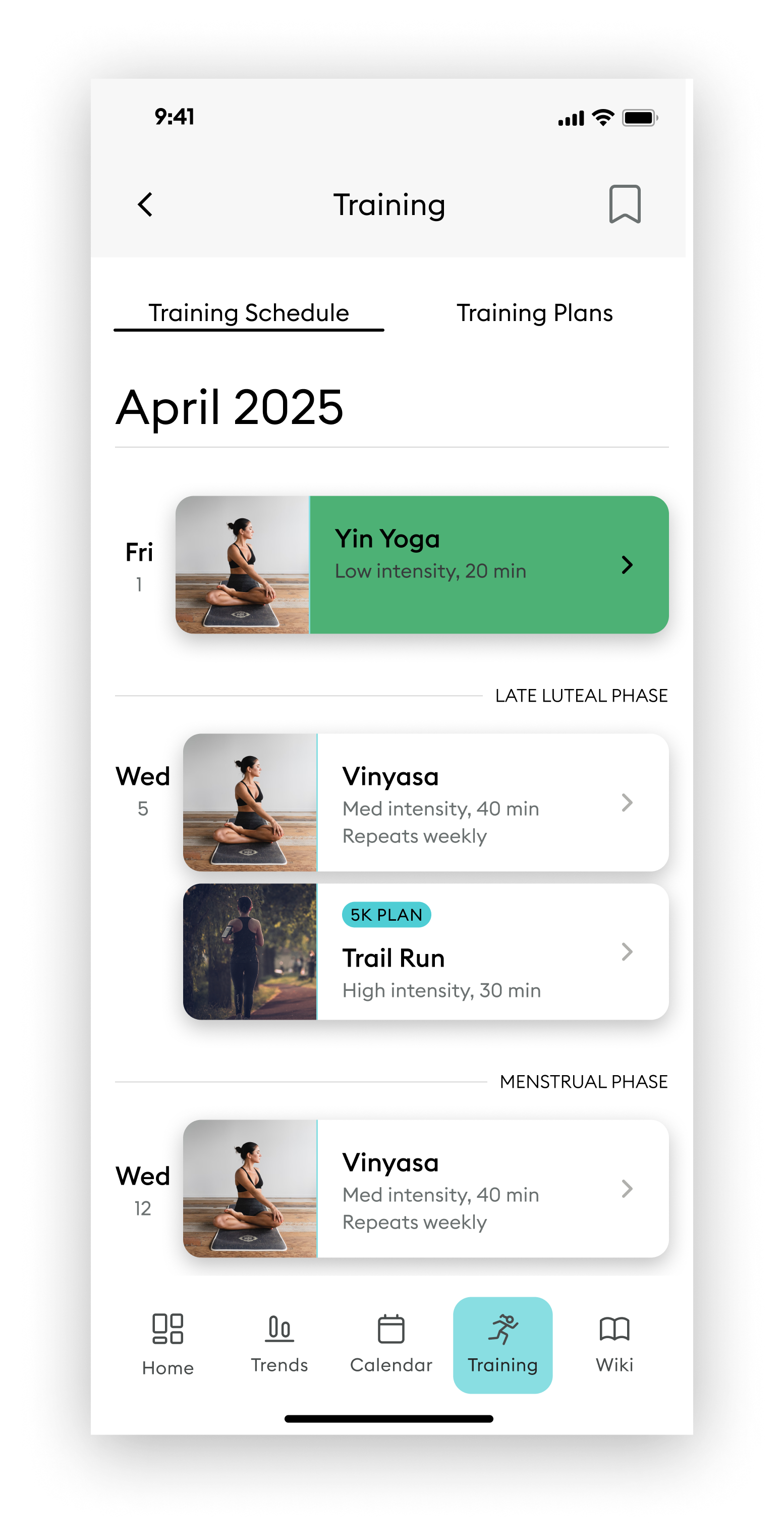
The original design of the training session schedule, which was missing a few key items.
The new ORCA "wireframe" of what the training session list item should be on the schedule.
The new design showing how the training sessions can have their associated plan clearly labelled.
One of the other major issues users had was that it was unclear what to do each day for a training plan because the plan was isolated from the training schedule.
They liked that the plan was broken up into phases, however, it had no connection to the actual schedule, even though as previously stated, the training plan sessions were added to the schedule.
The ORCA wireframe lays out how the new training plan should look, with a clear connection to the sessions it has and relevant CTAs, which I then translated into high fidelity.
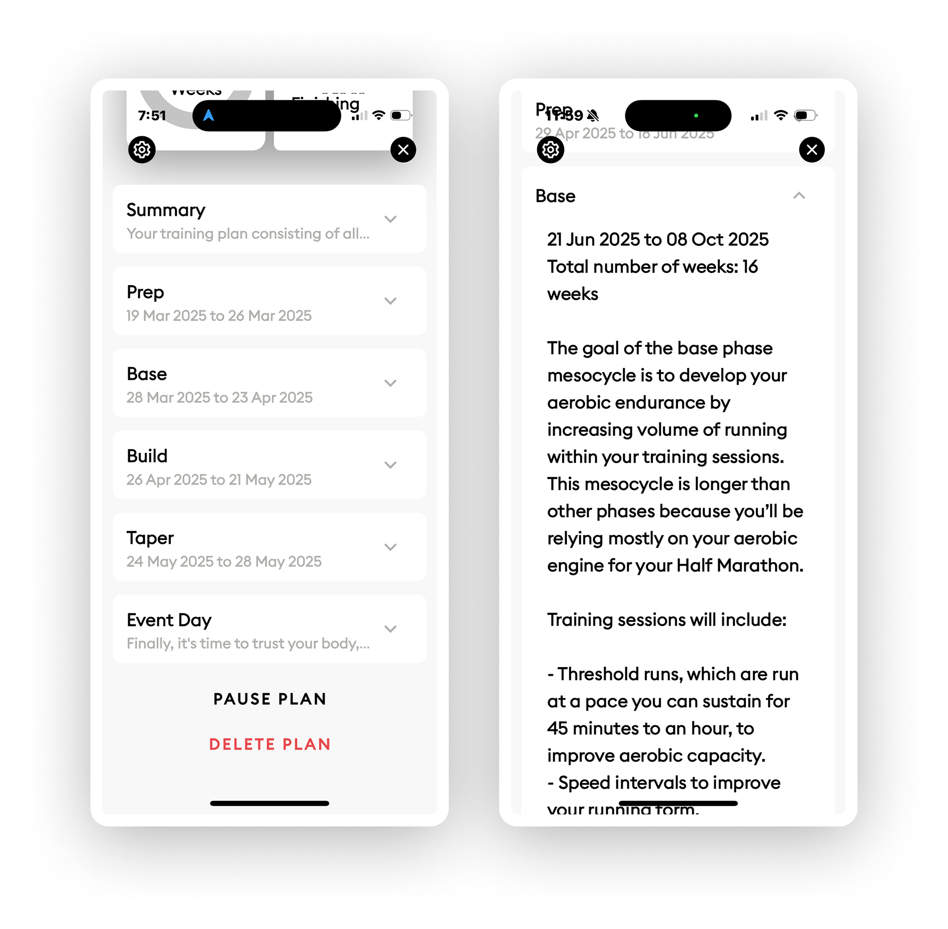
The old version of the training plan that did not show the training sessions within it.
My ORCA wireframe showing the attributes and CTAs related to a training plan's page.
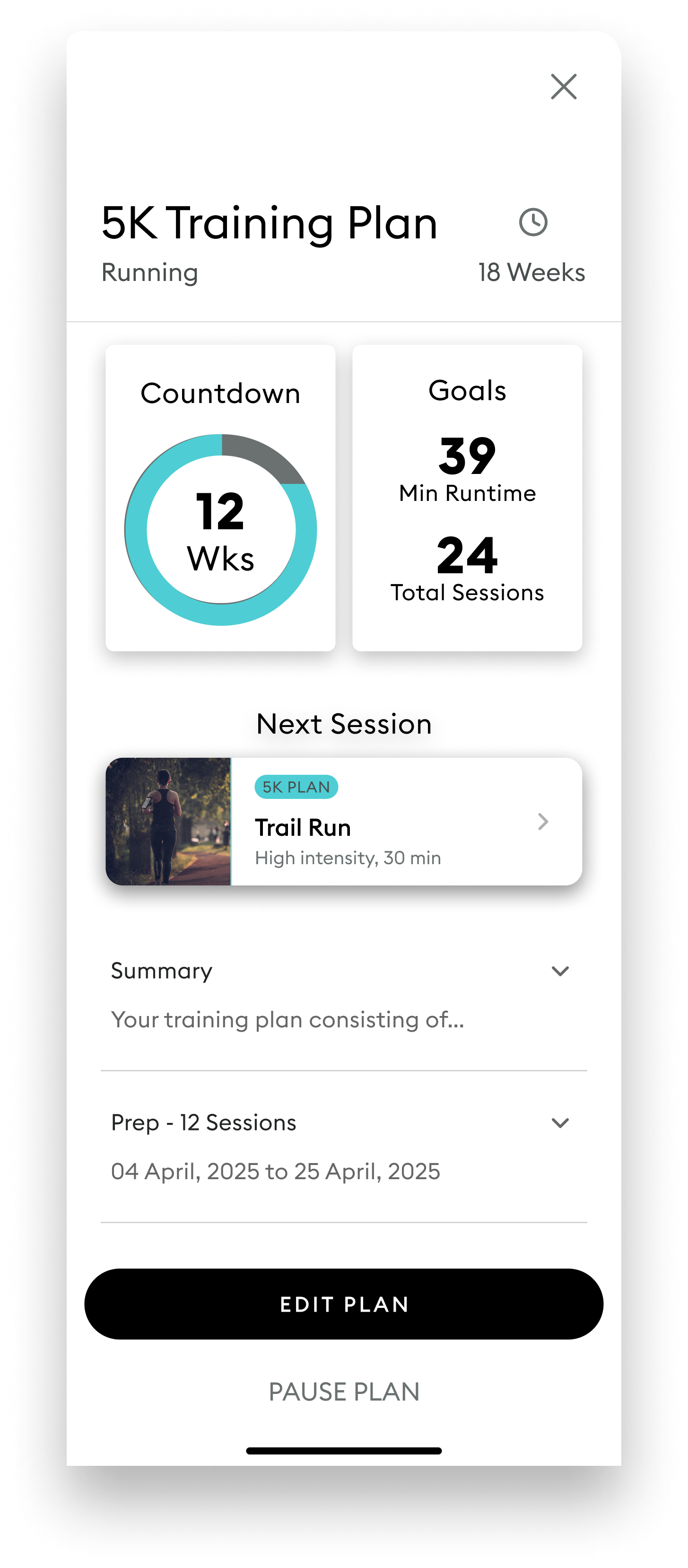
The new design with the next training session shown, and the number of sessions in each phase of the plan.
Conclusion
Due to some changes within the organization, I was unable to complete usability testing with the new designs to validate whether they made it more intuitive.
However, I’m confident that by completing the OOUX/ORCA process with my coworker, I successfully laid out designs that would resolve the issues that users faced during testing and in previous research, as well as any additional inconsistencies.
Thank you to my Wild.AI team!

Calendar page showing the user’s cycle, made by Lead Designer.
Future Suggestions
-
Provide more personalized recommendations for each session in a plan based on what cycle phase they will be in and cycle recommendations for one-off sessions
-
Have the app give smart suggestions on if the training session the user plans is a good idea based on their readiness score
-
When the user makes a training plan, the app can asses the user’s current fitness level to estimate if the user would be able to reach their plan goal based on the parameters
-
Lay out nutrition information and the trend information in a more readable way so that people can understand them more easily
Want to learn more?
Email me so we can chat about how I can help you! I’m actively looking for Product Design opportunities and ready to interview!
View My Next Project
Crafting an enterprise-wide UI kit to lay the foundation for scalability and consistency for digital medical devices at LivaNova